Tuesday 18 March 2014

Magazine Review Page

This is the final draft of my magazine review page, I hope you like it!


Film Poster

After having consulted my focus group, this was the finalised product for the film poster


Friday 7 March 2014

Evaluation - What have you learned from audience feedback?


For our evaluation we did three questions as a group (this being one of them). We felt this was easier as throughout the production process we had made decisions as a group. We combined all of our ideas and created a final cut video for each question excluding the ancillary question. 


Evaluation - How did you use media technologies in the construction and research, planning and evaluation stages?


For our evaluation we did three questions as a group (this being one of them). We felt this was easier as throughout the production process we had made decisions as a group. We combined all of our ideas and created a final cut video for each question excluding the ancillary question. 


Evaluation - In what ways did you use, develop, and challenge forms and conventions of real media products?


For our evaluation we did three questions as a group (this being one of them). We felt this was easier as throughout the production process we had made decisions as a group. We combined all of our ideas and created a final cut video for each question excluding the ancillary question. 


Monday 24 February 2014

Magazine Review Page


Here is the latest version of my review page, I may make a few adjustments here and there, but I feel that this is near enough completed.

Thursday 30 January 2014

Film Poster - Updated


Part of my focus group decided that the poster looked too dark, and the title and footer were detracting from the central image so I decided to alter the brightness of the image, I also decided to upload a blurred version of the poster, and a version that isnt blurred, I will then consult my focus group to see which of them they prefer.

The overall layout for my poster has been kept simplistic and similar to that of film posters from the 70's, my primary inspiration came from the Texas Chainsaw Massacres poster and Scream's poster as I really liked the overall layout and design of these posters.

Tuesday 28 January 2014

Magazine Review Page - Draft 2


Here are the current drafts of one of the review pages we have created, since the previous draft I have added a page tag to the right hand side of the page, we have seen this in numerous magazines so that groups of pages can be categorized together, I have also changed the colour scheme and layout of some of the text, also a still from our film has been added. I am currently undecided upon which colour the header should be, so I have uploaded both versions.


Sunday 19 January 2014

Documented Film Poster


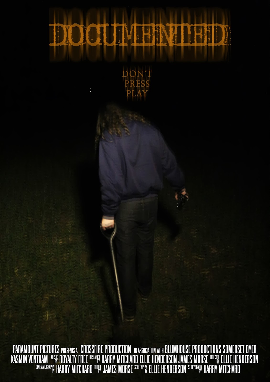
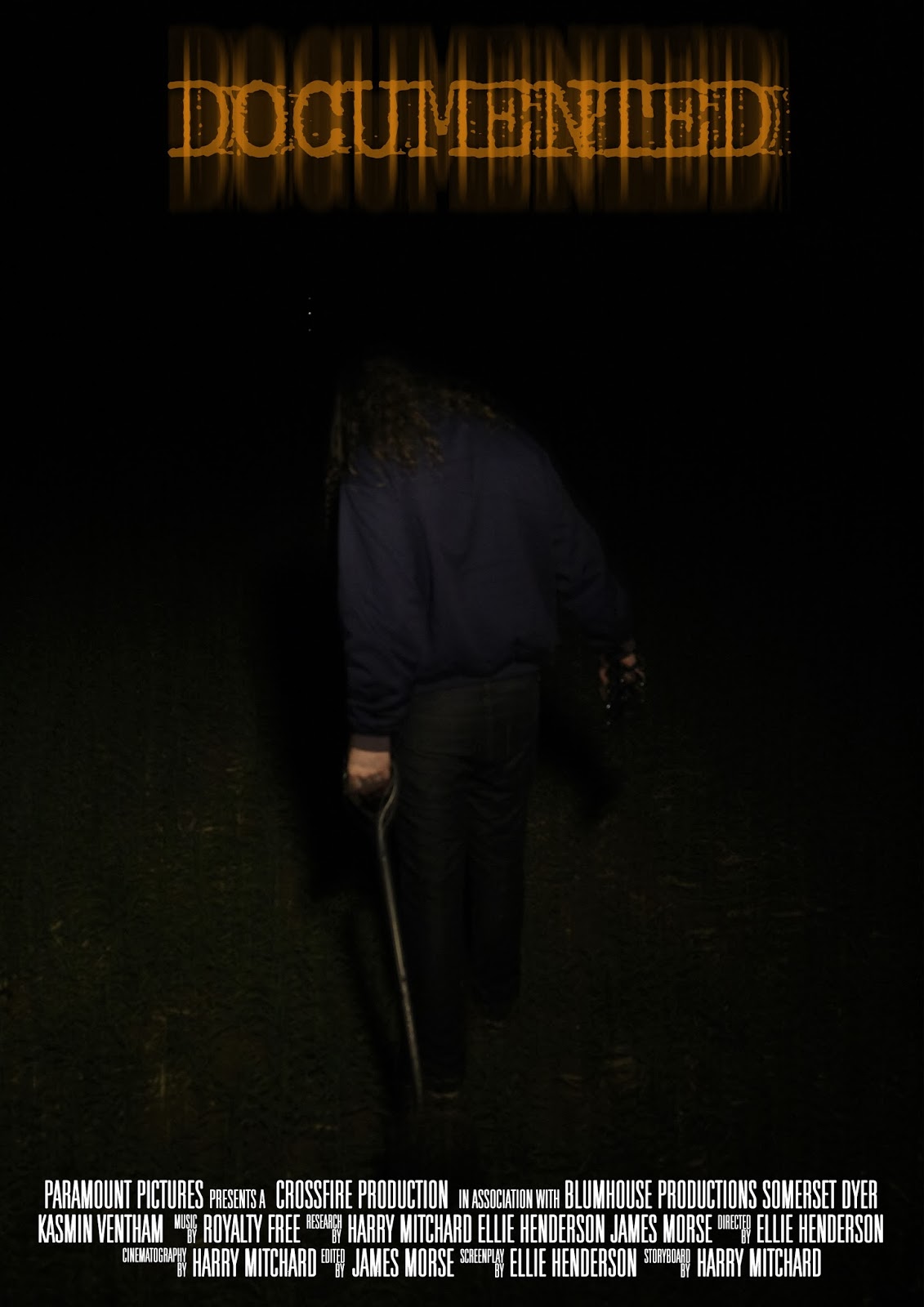
Here are two variations of one of the posters we have created for our film, there are two different versions as one consists of a tagline, the other, without. With this poster I aimed to create a simplistic design so that the audience are drawn primarily to the image and the title of the film, the design of this poster was inspired by the research that we had conducted into Texas Chainsaw Massacres poster, I liked the simplistic design and the dark imagery used.

After consulting our target audience as to which of the two they preferred, they decided they preferred the one with the tag line, as the one without felt "too empty"

Friday 10 January 2014

Magazine Review Page - Planning


Here are some sketches of the planning process for creating the layout of one of the Magazine Review pages.

Sunday 5 January 2014

Magazine Review Page


Here are the first 2 drafts of one of our potential magazine review pages, the review page on the left hand side consists of a larger image in order to fill the space at the top half of the page, a common convention we have noticed within our research into magazine review pages, however we have also considered applying a simple graphic that is eye catching and pulls in the readers attention, if we were to make a graphic it would be placed in the black white space under the final paragraph of the review page on the right, we will consult our focus group after having finished the production of these pages to see which layout they prefer.

Teachers Comments

Teachers Comments;

I had a thought today about the jump cut in your film. Especially if there are lots of them. You could find a way to make the video glitch, even insert some wierd frames of something else on a regular basis, to make it more horrible and have more of a found footage feel.