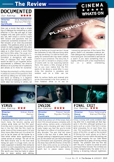
Here are the first 2 drafts of one of our potential magazine review pages, the review page on the left hand side consists of a larger image in order to fill the space at the top half of the page, a common convention we have noticed within our research into magazine review pages, however we have also considered applying a simple graphic that is eye catching and pulls in the readers attention, if we were to make a graphic it would be placed in the black white space under the final paragraph of the review page on the right, we will consult our focus group after having finished the production of these pages to see which layout they prefer.

No comments:
Post a Comment