For our evaluation we did three questions as a group (this being one of them). We felt this was easier as throughout the production process we had made decisions as a group. We combined all of our ideas and created a final cut video for each question excluding the ancillary question.
For our evaluation we did three questions as a group (this being one of them). We felt this was easier as throughout the production process we had made decisions as a group. We combined all of our ideas and created a final cut video for each question excluding the ancillary question.
For our evaluation we did three questions as a group (this being one of them). We felt this was easier as throughout the production process we had made decisions as a group. We combined all of our ideas and created a final cut video for each question excluding the ancillary question.
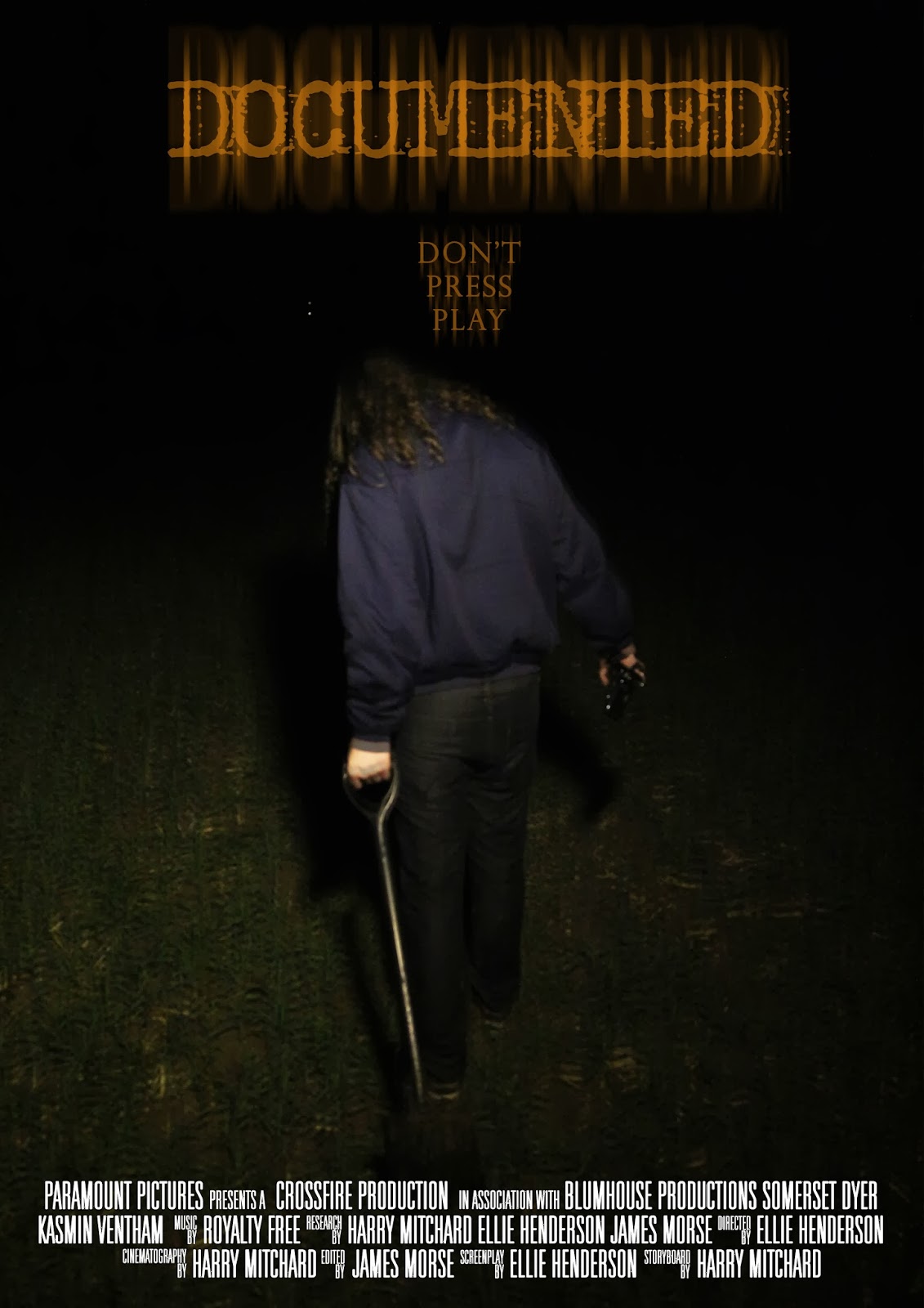
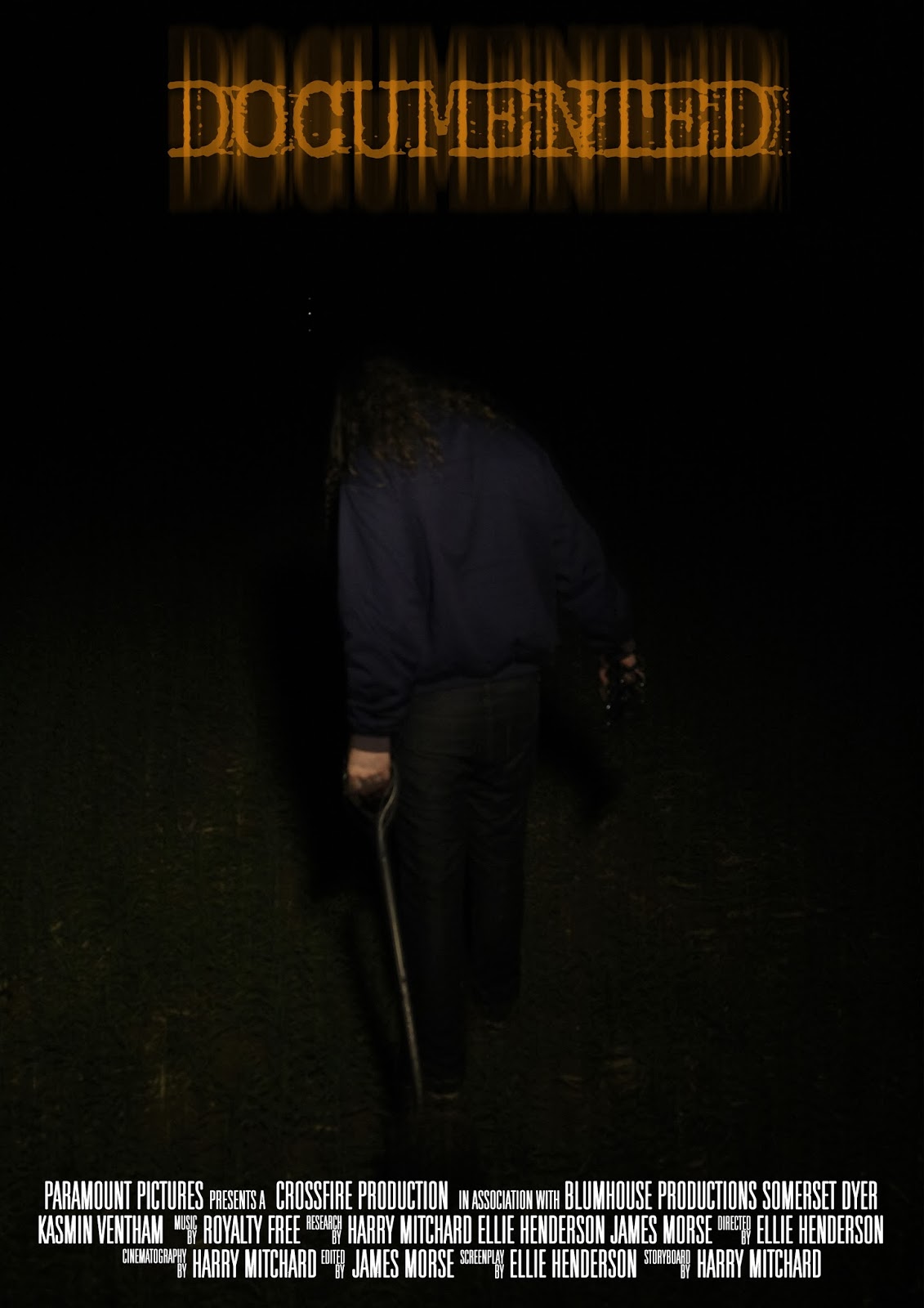
Part of my focus group decided that the poster looked too dark, and the title and footer were detracting from the central image so I decided to alter the brightness of the image, I also decided to upload a blurred version of the poster, and a version that isnt blurred, I will then consult my focus group to see which of them they prefer.
The overall layout for my poster has been kept simplistic and similar to that of film posters from the 70's, my primary inspiration came from the Texas Chainsaw Massacres poster and Scream's poster as I really liked the overall layout and design of these posters.
Here are the current drafts of one of the review pages we have created, since the previous draft I have added a page tag to the right hand side of the page, we have seen this in numerous magazines so that groups of pages can be categorized together, I have also changed the colour scheme and layout of some of the text, also a still from our film has been added. I am currently undecided upon which colour the header should be, so I have uploaded both versions.
Here are two variations of one of the posters we have created for our film, there are two different versions as one consists of a tagline, the other, without. With this poster I aimed to create a simplistic design so that the audience are drawn primarily to the image and the title of the film, the design of this poster was inspired by the research that we had conducted into Texas Chainsaw Massacres poster, I liked the simplistic design and the dark imagery used.
After consulting our target audience as to which of the two they preferred, they decided they preferred the one with the tag line, as the one without felt "too empty"
Here are the first 2 drafts of one of our potential magazine review pages, the review page on the left hand side consists of a larger image in order to fill the space at the top half of the page, a common convention we have noticed within our research into magazine review pages, however we have also considered applying a simple graphic that is eye catching and pulls in the readers attention, if we were to make a graphic it would be placed in the black white space under the final paragraph of the review page on the right, we will consult our focus group after having finished the production of these pages to see which layout they prefer.
I had a thought today about the jump cut in your film. Especially if there are lots of them. You could find a way to make the video glitch, even insert some wierd frames of something else on a regular basis, to make it more horrible and have more of a found footage feel.
Here is a basic template idea of how we intend to layout one of our review pages, we feel this will be a good way of laying out our review page as it will enable us to write a short review for our film, this will be much easier than writing a full page review for a short film. The three reviews at the bottom will be filled with our own reviews of other short films that we have watched from our short film research.
Recently we have been working on our production, of which
entails editing and filming the first part of our film. Some of the challenges
that we faced were putting our initial ideas into practice and doing what the
screenplay suggested to a level that we were happy with. Throughout the filming
process we decided that some minor changes would need to be taken into effect
such as multiple different shots all edited in to one scene such as when the
protagonist gets a call on Skype as opposed to one shot with little movement.
We decided that it would be more effective to have around three different
angles ranging from a mid-shot, to a high angle shot in the corner of the room
to a low angle shot of the protagonist. As a way to document these potential
changes after the fact we will create a third screenplay which will follow the
final product to the letter, the changes we have made will be evident in the comparison
between the second and the third screenplay, a document will accompany the
third which clearly lists the changes made.
After having consulted out focus group to see which REC symbol would look best for the handheld camera scenes, the images abvove were chosen to be the best, as opposed to these two images below;
During the editing process of our film it became clear that it would be necessary
to include static to represent the fact that the video camera is turning on
initially. We decided to do this by including a royalty free stock footage of
static to place in front of the first section that is filmed off of the
supposed antagonist’s video camera.
It may be possible to incorporate this in other sections of
the film such as having the camera stutter to give off more of an impression
that the killer has taped over the original film, this both shows the
antagonist as more of a villain and establishes the fact that this kill is not isolated.
This reinstates what it is we would like the scrapbook to present to the
audience.
We presented our focus group with two different pieces of
video static and from this they decided that this static is the most effective
and fits the film the best:
This static was also considered but rejected by the focus
group as they felt it was less effective than the aforementioned video static.
Here is a Prezi that looks in detail at two pages from Total Film and Empire magazine. the Prezi attempts to explain the codes and conventions in which we have looked at as well as informing to what is possible and would work well with our own film and its subsequent review.